How Surroundings Impact Color
Understanding the factors that affect color can lead to more confident choices
Have you painted a room and then realized it looked all wrong? Relying solely on color palettes can sometimes lead to frustrating results. I wanted to share the information that gave me a bit more insight and control over the process.
Welcome new friends and thank you for reading.
Umberto Eco once said, "Colour is not an easy matter." Some people are inherently intuitive when it comes to color, while others struggle with it. Choosing colors is challenging, even for professionals, and it may be unrelated to actual skill but rather stems from a lack of confidence or a fear of risk-taking because the results could be unexpected. Color for interiors is especially confusing because it is nuanced and multidimensional challenge that goes beyond aesthetics. Designers must account for the psychological impact of colors, cultural connotations, and the practical aspects of lighting and material choices and wrap it all in an effective visual language.
“Color is the least comprehensible aspect of design. We find it easier to explain function or form, than the reasons for color choices. There is a lot of hesitation to go beyond the blacks, whites, grays and beiges for fear of making mistakes.” Rolf Fehlbaum, chairman of Vitra1
Mr. Fehlbaum is well-equipped to understand this given Vitra's extensive history of collaboration with designers such as Charles and Ray Eames, George Nelson, and Jean Prouvé. I’ve had many of my own struggles with color so it was heartening to read this.
Systems are meant to be tools not outcomes
There is a lot to be gained from good color choices, but when we make mistakes, there is also much to lose. Mistakes can lead to unhappy clients, increased costs, as well as feelings of sadness, frustration, or disappointment. To avoid mistakes, it may seem safer to rely on conventional methods for selecting colors based on accepted principles or pre-determined palettes. These methods take a mathematical and scientific approach to hue, value (lightness/darkness), and intensity. System-based palettes are excellent for fundamentals but can fall short in real-life. This is the same reason why replicating a photo from the internet often does not yield the same result and you wonder what went wrong?
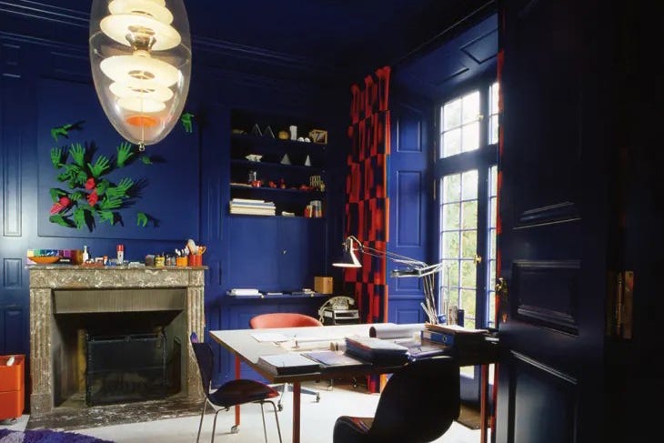
Some designers, like Verner Panton, eschew convention and experiment with unexpected color combinations. Despite Panton's design training and excellent grasp of color theory, his choices came from intuition, observation and continual experimentation.
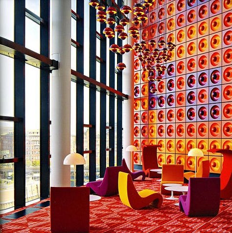
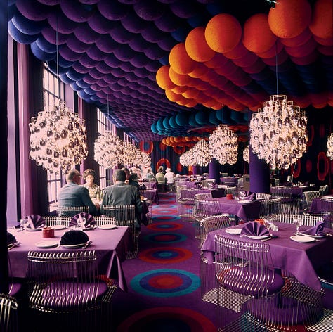

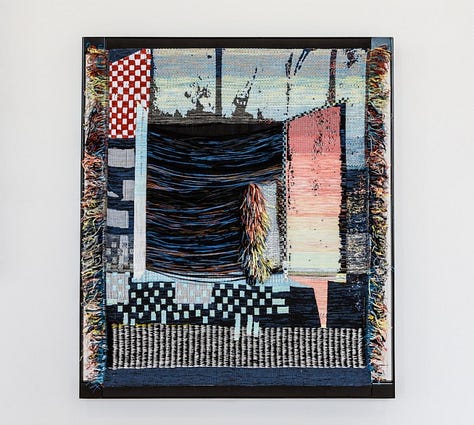
Contemporary designers like Hella Jongerius have also pushed the boundaries to create innovative work, often featuring distinctive and unconventional color choices. Their approach to color is contextual and integrated. But it also comes out of a deep understanding of how light, color and objects interact with one another.


How to become more comfortable with color
If interior spaces were controlled lab environments, then pre-defined palettes would work. In the real world, we have different geographies, changing natural light, the interplay of materials, surfaces, and their reflections, all of which need to be harmonized. It can feel out of control but one can become more confident with color with a better understanding of how and what causes it to change.
A known variable is light. For example, Van Gogh was interested in the emotional and expressive qualities of color. So he would often paint the same scene at different times of the day to observe how light affected colors. Here are some key factors with an explanation of how they impact color.
Light
It used to puzzle me when I read that north-facing rooms are the darkest and then I found out that this is not correct. The sun's path affects the day's length, the amount and direction of light, as well as, its color. All of these can change seasonally and based on where you live. What’s true up north is not true below the equator. Understanding how the sun’s rays land on each hemisphere combined with an understanding of color temperature is helpful in assessing the effects of sunlight in different rooms.
The earth always remains oriented along the same axis as it rotates the sun. In December, the earth is tilted away from the sun (far right). In June it is tilted towards the sun (far left). The diagram also shows where light rays fall on earth, in each season.
Far Right (December) > Winter in the Northern hemisphere/Summer in the Southern
Southern exposures get more direct light and northern exposures gets indirect light (diffused and less warm i.e cooler)
Far Left (June) > Winter in the Southern hemisphere/Summer in the Northern
Northern exposures get more direct light and southern exposures gets indirect light
I apologize in advance if some of the light info is a bit technical. I wanted to share it because it makes it easier to understand why and how sunlight changes. But please do let me know if it’s confusing or complicated.
Time of day
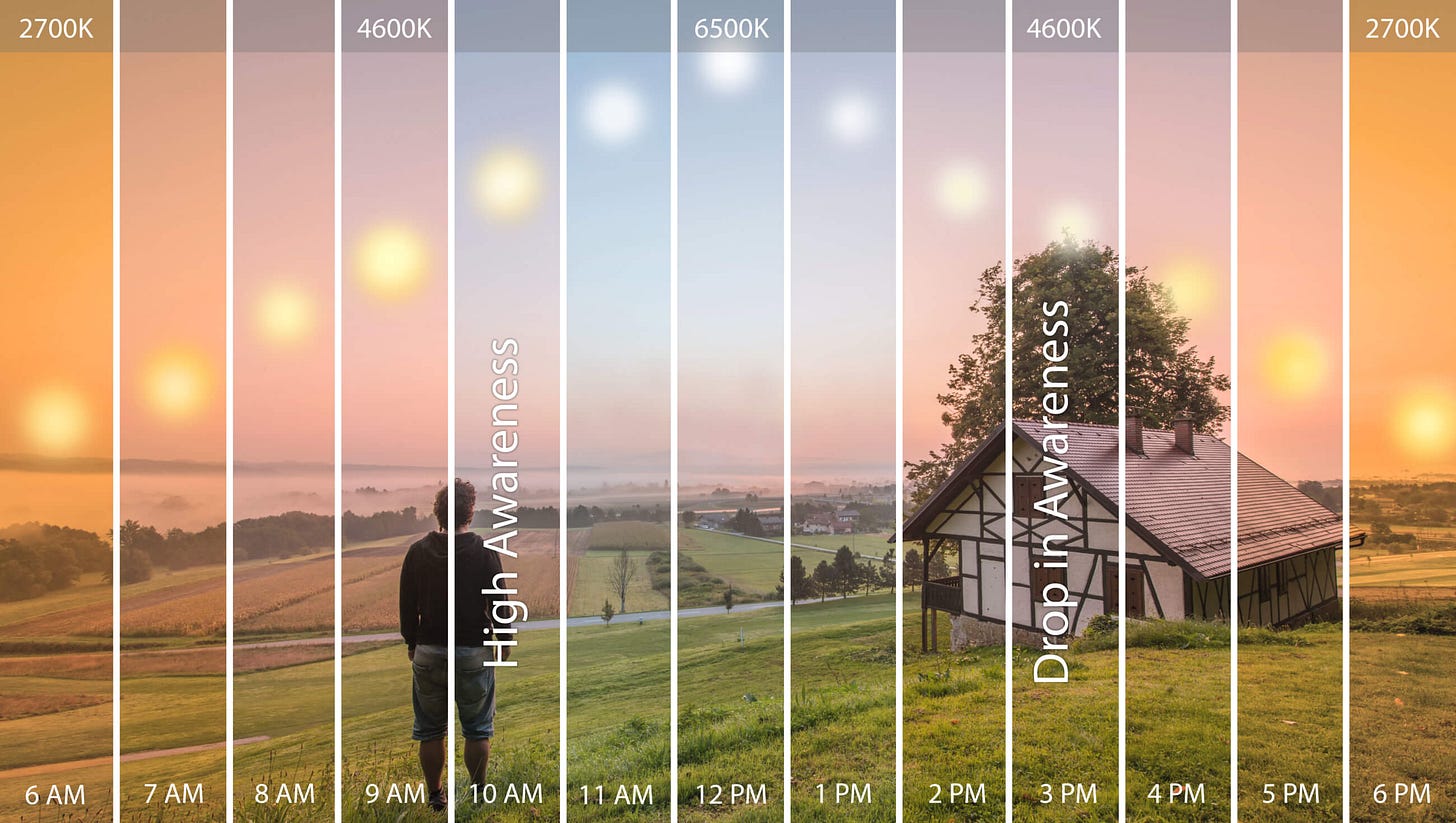
The color cast of the sun will change how objects look throughout the day. Look up at the sky and notice how it changes. Also notice how sunlight interacts with interior colors over the course of the day.
Morning: Morning light changes in color and quality as the sun rises and the atmosphere changes. The initial light is cold and clear with a hint of blue. This will shift as the morning progresses to the warmer hues of blue and yellow, followed by red and green as the sun gains altitude.
Afternoon: The midday light is direct, and intense which can bring out the vibrancy and saturation of colors in the environment. Green, in particular, can appear highly saturated making it prominent.
Late Afternoon: When the sun is descending, the light can take on an ethereal character. Colors may appear vivid and often look different than the true colors of objects.
Cloudy (Ambient): On a cloudy day, natural light can be diffused soft and more even. It is typically cooler.
Evening: Natural light acquires warm tones; orange, red, and purple. It can either enhance the saturation and vibrancy of colors or create a more subdued, bleached-out appearance. With artificial light the color is determined by the type of light, bulbs and arrangement of light sources.
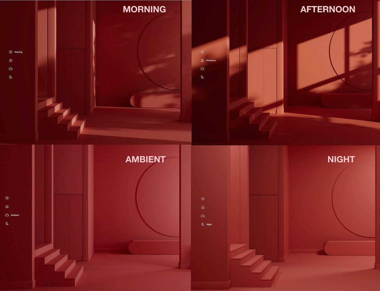
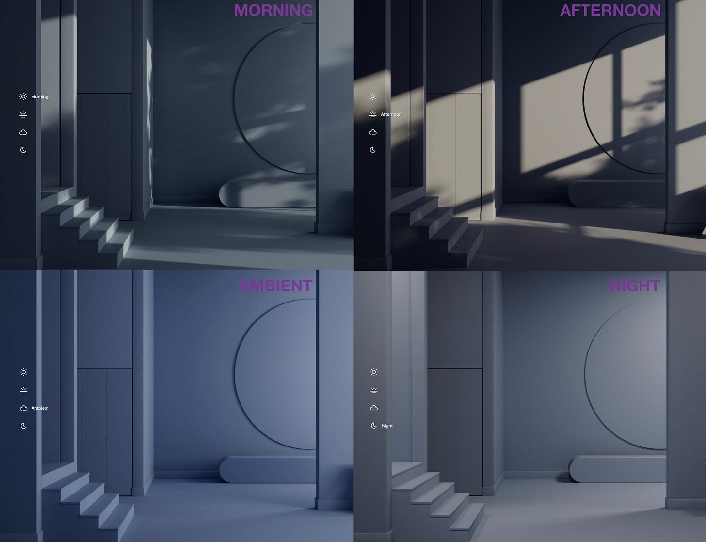
I used the Benjamin Moore site tool to look at how red and blue paint color changed with the light. You can begin to see how different the room looks at different times of day. Also observe how the relationship of the background to the type changes.
Materials
The choice of material and its inherent qualities, such as texture, finish, proximities and arrangement can impact how colors are perceived.

Surface
The surfaces of three dimensional planar objects create distinct boundaries between light and shadow which affects the overall color. Curved surfaces, on the other hand exhibit color gradations making it challenging to distinguish where one color ends and shades shift. The light and colors in a room can change based on the objects, their shapes and colors, their relative positions and how light interacts with them individually and together.
Relativity and interactions
Different colors exhibit varying levels of reflectivity and intensity. Colors change based on context which means the surrounding color landscape can influence our perception of an object's color, and objects interact with light and space to create diverse color experiences. For instance, black absorbs most light, while white acts like a mirror, intensifying reflections.

In some schools, students mix hundreds of paint colors so they can begin to understand how colors work but that’s still only one part of the puzzle. You might throw up your hands in the air and say ‘I’ll never figure this out’. This is how I feel most of the time with complex things. But I have realized it is not about figuring everything out. It’s about being aware, observing and trying things. In the end what’s important is the next time you are in room, you start to think differently about it.
Have you ever had a hard time choosing colors or decorated a room that just wouldn’t come out right? If so, how did you fix it? I would love to hear about your experiences.
More in my next post. Be well.
Related content:
Become Enlightened
I had initially planned to write a functional post about layered lighting. But it's equally important to understand it from an artistic perspective because the functional approach is killing my soul, and perhaps yours too.
Plant In-sanity
(Paid post) In Feng Shui, negative energy can manifest itself as challenges and difficulties, such as a problematic renovation. However, there are things one can do to improve aspects of life using Feng Shui. This is my exploration into finding plants to try and change my 'ch'i.'
Queen’s Repository
Reading
Vitra: What is color by Verner Panton
Books
Josef Albers: Interaction of Color
Video
Alber’s Color Course (free)
Albers Foundation Workshop #1
Simultaneous Contrast
Apps
Interaction of Color app (unavailable in the US)








Oh this was a delightful read! It covers so much of what I’ve had on my mind and have been learning about of late! When I see an image of a Verner Panton room, not heart beats faster from happiness and appreciation! And then my next thought is inevitably...why are rooms like this still so rare? Such a shame! And that kind of impulse fuels my exploration for AI for interiors!
The relative aspect of colour and how it changes to our eyes based on the colours around it - it’s fascinating!
Josef Albers reading has been on my To Do list - thank you for those links!
I don't know about the technical parts of this but it is SO TRUE that colors change according to light, furnishings, and other factors. I've painted MANY times and yet, in my Idaho home, I've been completely flummoxed by how much the paint changes in each room and almost by the hour and isn't what I expected. In the end, my home will be much more yellow than I expected or wanted. But at least I like yellow.
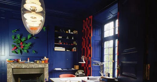
Which is a good time to mention how colors play into our moods. That blue in the office I could never do. Never. Yet yellow in a bedroom is considered a no-no and I love it, have done it now in 3 homes. I loved having chocolate brown in my office for 10 years and always thought it would be an amazing color for a dining room. My husband, however, has nixed the idea of "anything dark" and his definition of dark is far lighter than mine. Alas.
I'm a strong believer that "design" needs to fit our personality, sensibilities, and moods. What may look absolutely amazing in another person's home can be completely the wrong thing in your own. And vice-versa ;)